library(tidyverse)
#> ── Attaching core tidyverse packages ───────────────────── tidyverse 2.0.0 ──
#> ✔ dplyr     1.1.2     ✔ readr     2.1.4
#> ✔ forcats   1.0.0     ✔ stringr   1.5.0
#> ✔ ggplot2   3.4.2     ✔ tibble    3.2.1
#> ✔ lubridate 1.9.2     ✔ tidyr     1.3.0
#> ✔ purrr     1.0.1
#> ── Conflicts ─────────────────────────────────────── tidyverse_conflicts() ──
#> ✖ dplyr::filter() masks stats::filter()
#> ✖ dplyr::lag()    masks stats::lag()
#> ℹ Use the conflicted package (<http://conflicted.r-lib.org/>) to force all conflicts to become errors10 Layers
Prerequisites
10.2.1 Exercises
-
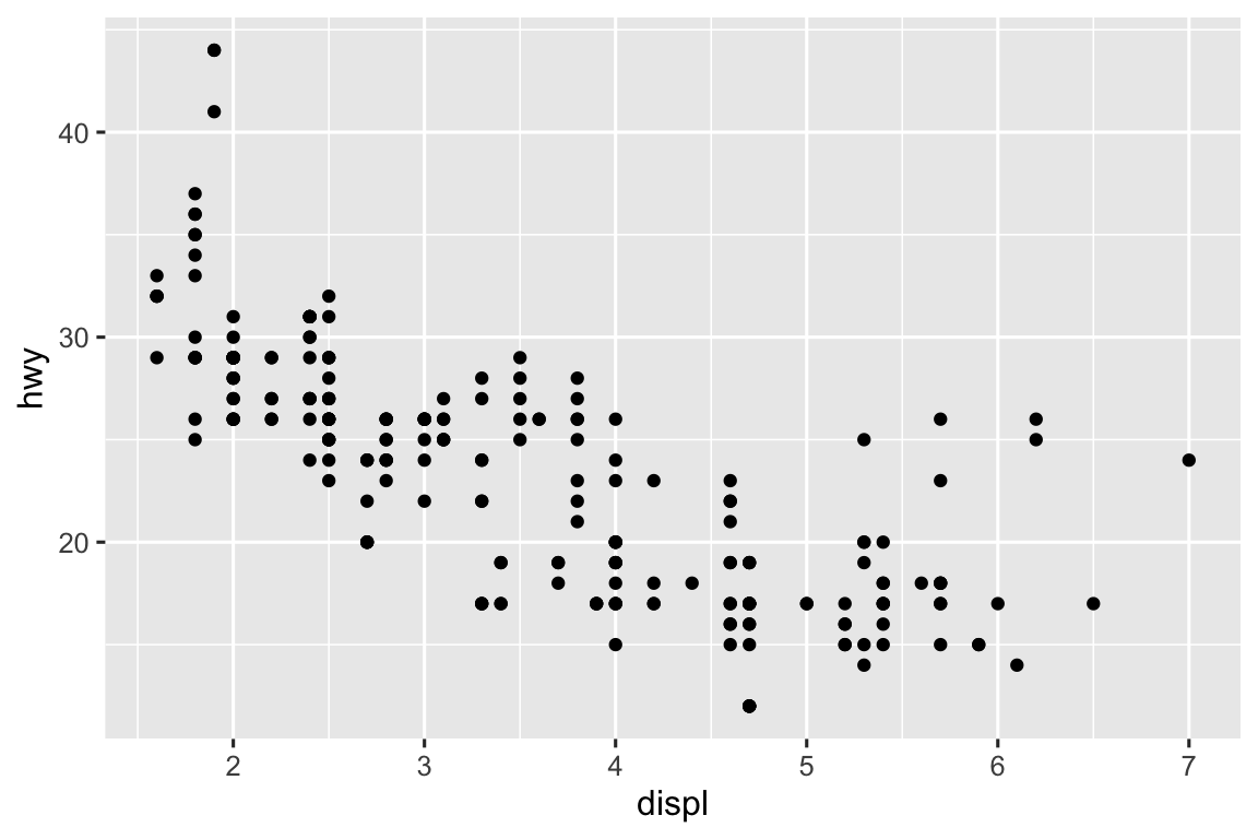
Below is a scatterplot of
hwyvs.displwhere the points are pink filled in triangles.ggplot(mpg, aes(x = hwy, y = displ)) + geom_point(color = "pink", shape = "triangle")
-
Color should be set outside of the aesthetic mapping.
ggplot(mpg, aes(x = displ, y = hwy)) +
  geom_point(color = "blue")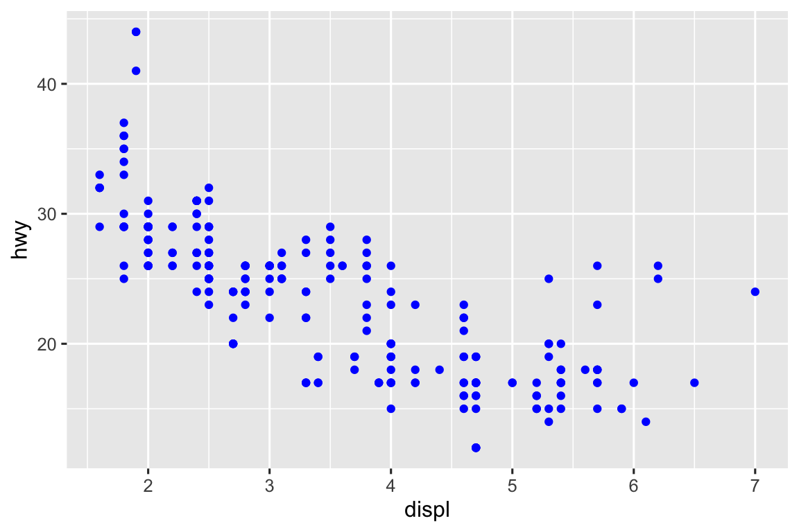
Stroke controls the size of the edge/border of the points for shapes 21-24 (filled circle, square, triangle, and diamond).
-
It creates a logical variable with values
TRUEandFALSEfor cars with displacement values below and above 5. In general, mapping an aesthetic to something other than a variable first evaluates that expression then maps the aesthetic to the outcome.ggplot(mpg, aes(x = hwy, y = displ, color = displ < 5)) + geom_point()
10.3.1 Exercises
For a line chart you can use
geom_path()orgeom_line(). For a boxplot you can usegeom_boxplot(). For a histogram,geom_histogram(). For an area chart,geom_area().-
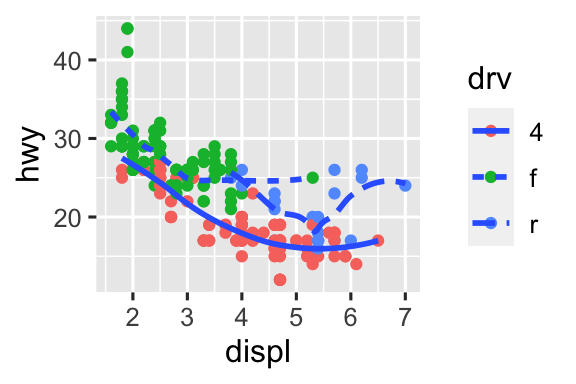
It removes the legend for the geom it’s specified in, in this case it removes the legend for the smooth lines that are colored based on
drv.ggplot(mpg, aes(x = displ, y = hwy)) + geom_smooth(aes(color = drv), show.legend = FALSE) #> `geom_smooth()` using method = 'loess' and formula = 'y ~ x'
It displays the confidence interval around the smooth lin. You can remove this with
se = FALSE.-
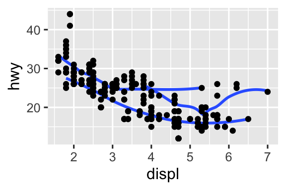
The code for each of the plots is given below.
ggplot(mpg, aes(x = displ, y = hwy)) +
  geom_point() +
  geom_smooth(se = FALSE)
ggplot(mpg, aes(x = displ, y = hwy)) +
  geom_smooth(aes(group = drv), se = FALSE) +
  geom_point()
ggplot(mpg, aes(x = displ, y = hwy, color = drv)) +
  geom_point() +
  geom_smooth(se = FALSE)
ggplot(mpg, aes(x = displ, y = hwy)) +
  geom_point(aes(color = drv)) +
  geom_smooth(se = FALSE)
ggplot(mpg, aes(x = displ, y = hwy)) +
  geom_point(aes(color = drv)) +
  geom_smooth(aes(linetype = drv), se = FALSE)
ggplot(mpg, aes(x = displ, y = hwy)) +
  geom_point(size = 4, color = "white") +
  geom_point(aes(color = drv))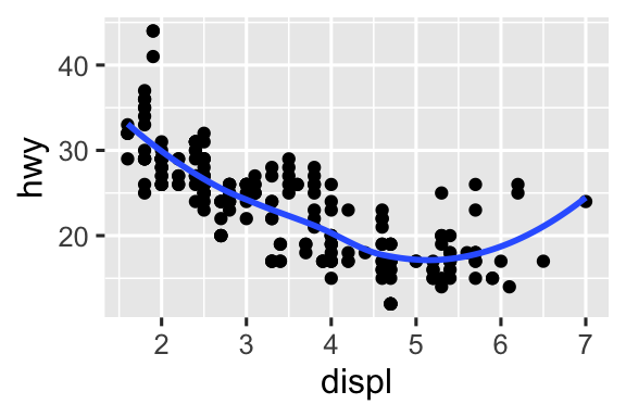


10.4.1 Exercises
-
Faceting by a continuous variable results in one facet per each unique value of the continuous variable. We can see this in the scatterplot below of
cylvs.drv, faceted byhwy.ggplot(mpg, aes(x = drv, y = cyl)) + geom_point() + facet_wrap(~hwy)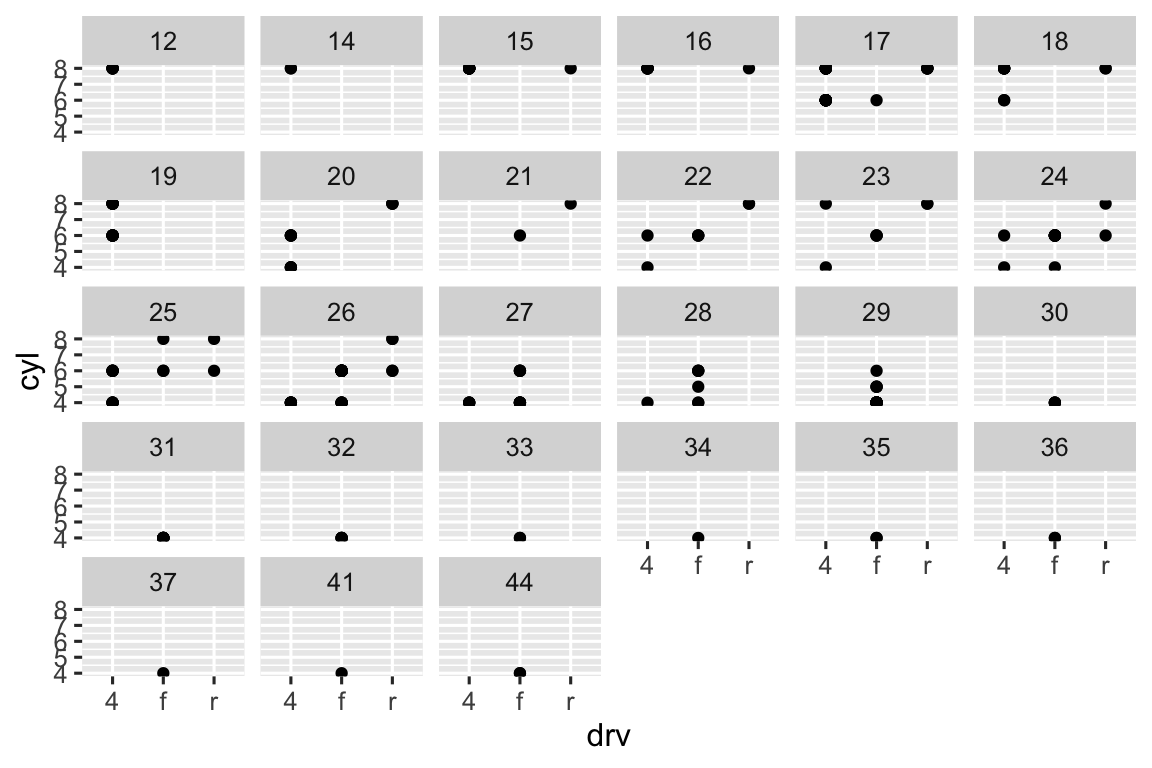
-
There are no cars with front-wheel drive and 5 cylinders, for example. Therefore the facet corresponding to that combination is empty. In general, empty facets mean no observations fall in that category.
ggplot(mpg) +
  geom_point(aes(x = drv, y = cyl)) +
  facet_grid(drv ~ cyl)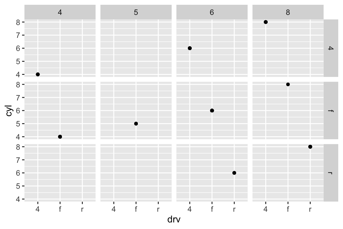
-
In the first plot, with
facet_grid(drv ~ .), the period means “don’t facet across columns”. In the second plot, withfacet_grid(. ~ drv), the period means “don’t facet across rows”. In general, the period means “keep everything together”.ggplot(mpg) + geom_point(aes(x = displ, y = hwy)) + facet_grid(drv ~ .) ggplot(mpg) + geom_point(aes(x = displ, y = hwy)) + facet_grid(. ~ cyl)

-
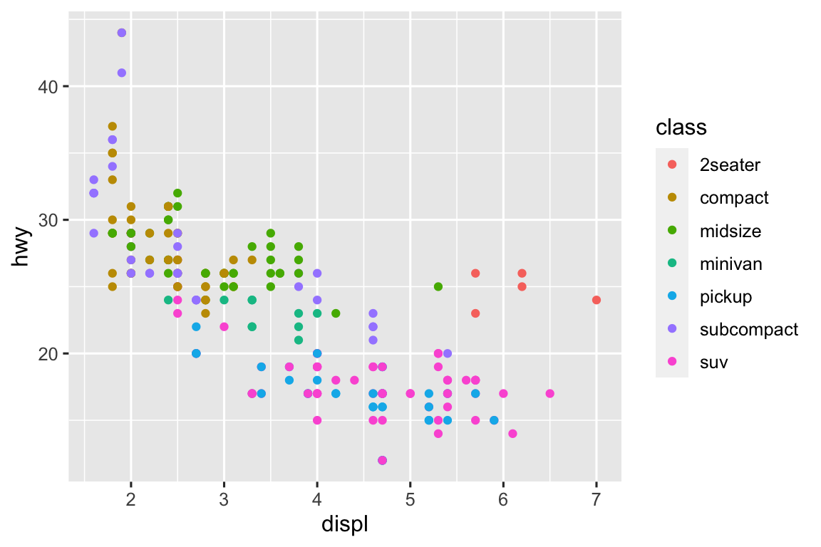
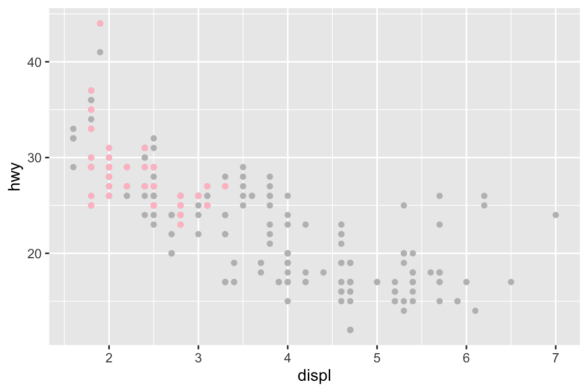
The advantages of faceting is seeing each class of car separately, without any overplotting. The disadvantage is not being able to compare the classes to each other as easily when they’re in separate plots. Additionally, color can be helpful for easily telling classes apart. Using both can be helpful, but doesn’t mitigate the issue of easy comparison across classes. If we were interested in a specific class, e.g. compact cars, it would be useful to highlight that group only with an additional layer as shown in the last plot below.
# facet
ggplot(mpg) +
  geom_point(aes(x = displ, y = hwy)) +
  facet_wrap(~ class, nrow = 2)

# color
ggplot(mpg) +
  geom_point(aes(x = displ, y = hwy, color = class))

# both
ggplot(mpg) +
  geom_point(
    aes(x = displ, y = hwy, color = class),
    show.legend = FALSE) +
  facet_wrap(~ class, nrow = 2)

# highlighting
ggplot(mpg, aes(x = displ, y = hwy)) +
  geom_point(color = "gray") +
  geom_point(
    data = mpg |> filter(class == "compact"),
    color = "pink"
  )

nrowcontrols the number panels andncolcontrols the number of columns the panels should be arranged in.facet_grid()does not have these arguments because the number of rows and columns are determined by the number of levels of the two categorical variablesfacet_grid()plots.dircontrols the whether the panels should be arranged horizontally or vertically.-
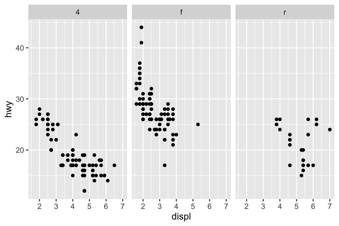
The first plot makes it easier to compare engine size (
displ) across cars with different drive trains because the axis that plotsdisplis shared across the panels. What this says is that if the goal is to make comparisons based on a given variable, that variable should be placed on the shared axis.ggplot(mpg) + geom_point(aes(x = displ, y = hwy)) + facet_grid(drv ~ .) ggplot(mpg) + geom_point(aes(x = displ, y = hwy)) + facet_grid(. ~ drv)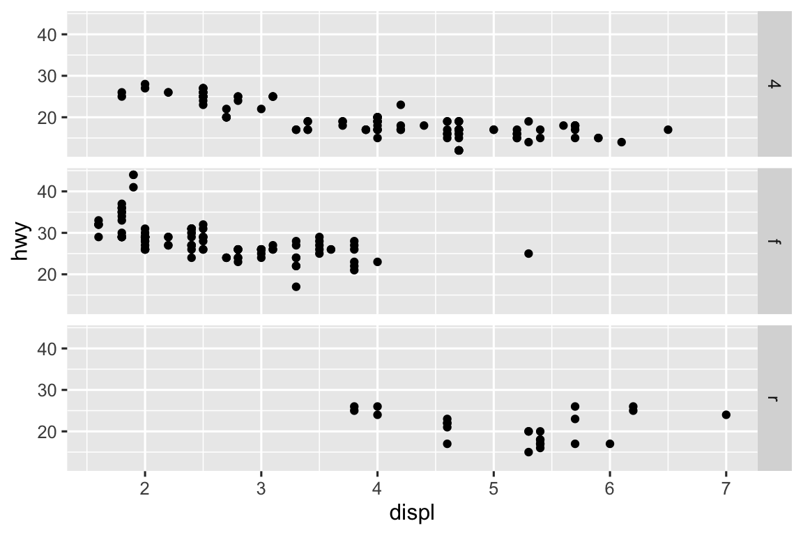
-
Facet grid chose to use rows instead of columns in the first code.
ggplot(mpg) +
  geom_point(aes(x = displ, y = hwy)) +
  facet_grid(drv ~ .)

ggplot(mpg) +
  geom_point(aes(x = displ, y = hwy)) +
  facet_wrap(~drv, nrow = 3)

10.5.1 Exercises
-
The default geom of stat summary is
geom_pointrange(). The plot from the book can be recreated as follows. geom_col()plots the heights of the bars to represent values in the data, whilegeom_bar()first calculates the heights from data and then plots them.geom_col()can be used to make a bar plot from a data frame that represents a frequency table, whilegeom_bar()can be used to make a bar plot from a data frame where each row is an observation.-
Geoms and stats that are almost always used in concert are listed below:
-
stat_smooth()computes the following variables:-
yorx: Predicted value -
yminorxmin: Lower pointwise confidence interval around the mean -
ymaxorxmax: Upper pointwise confidence interval around the mean -
se: Standard error
-
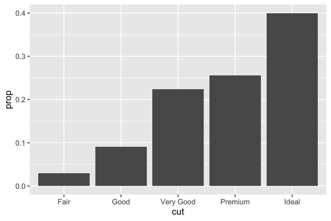
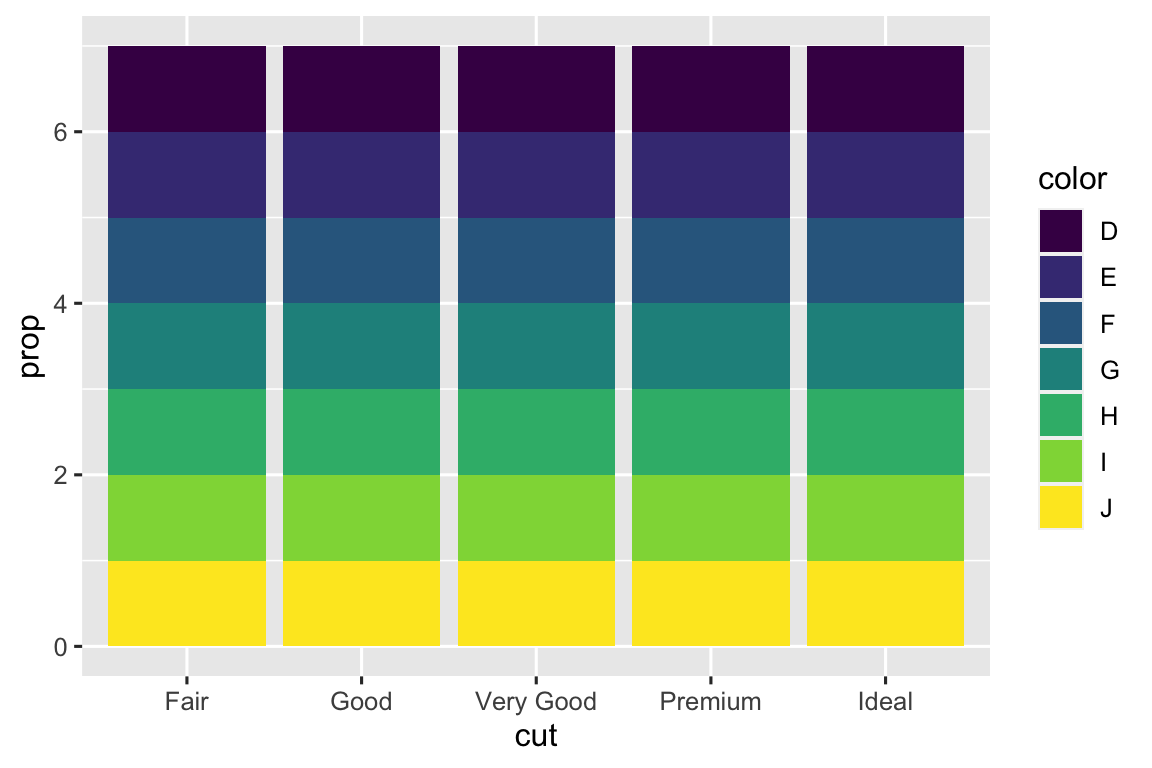
-
In the first pair of plots, we see that setting
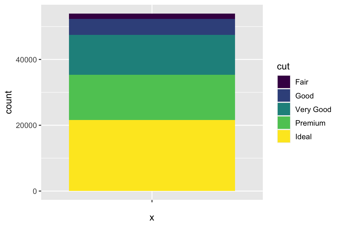
group = 1results in the marginal proportions ofcuts being plotted. In the second pair of plots, settinggroup = colorresults in the proportions ofcolors within eachcutbeing plotted.# one variable ggplot(diamonds, aes(x = cut, y = after_stat(prop))) + geom_bar() ggplot(diamonds, aes(x = cut, y = after_stat(prop), group = 1)) + geom_bar() # two variables ggplot(diamonds, aes(x = cut, fill = color, y = after_stat(prop))) + geom_bar() ggplot(diamonds, aes(x = cut, fill = color, y = after_stat(prop), group = color)) + geom_bar()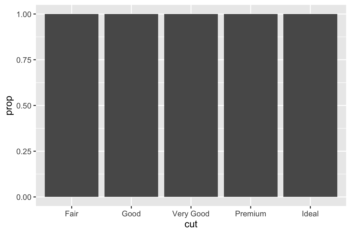


10.6.1 Exercises
-
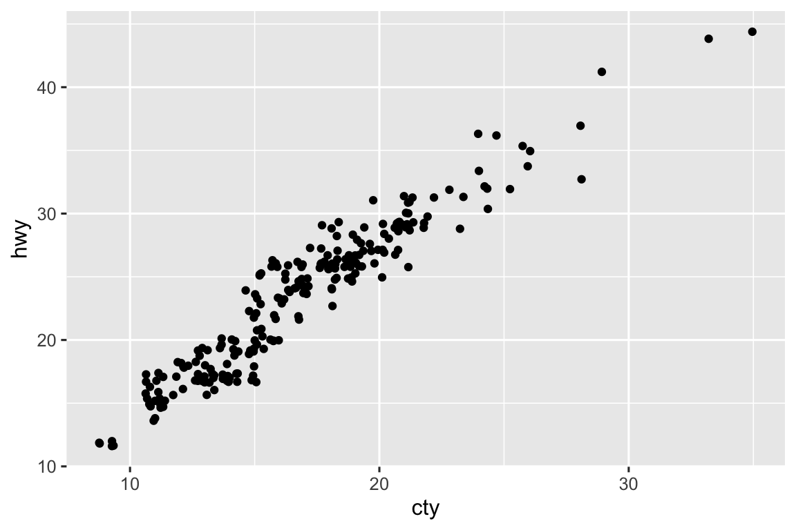
The
mpgdataset has 234 observations, however the plot shows fewer observations than that. This is due to overplotting; many cars have the same city and highway mileage. This can be addressed by jittering the points.ggplot(mpg, aes(x = cty, y = hwy)) + geom_point() ggplot(mpg, aes(x = cty, y = hwy)) + geom_jitter()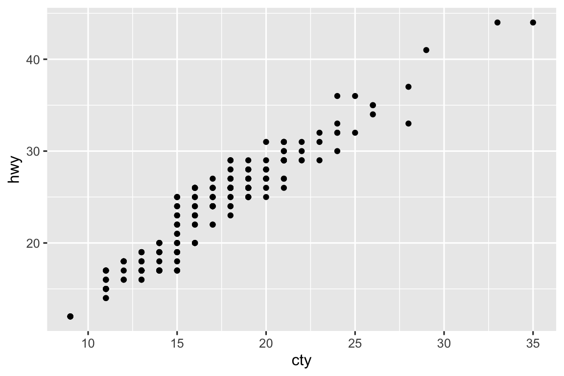
-
The two plots are identical.
ggplot(mpg, aes(x = displ, y = hwy)) +
  geom_point()
ggplot(mpg, aes(x = displ, y = hwy)) +
  geom_point(position = "identity")
-
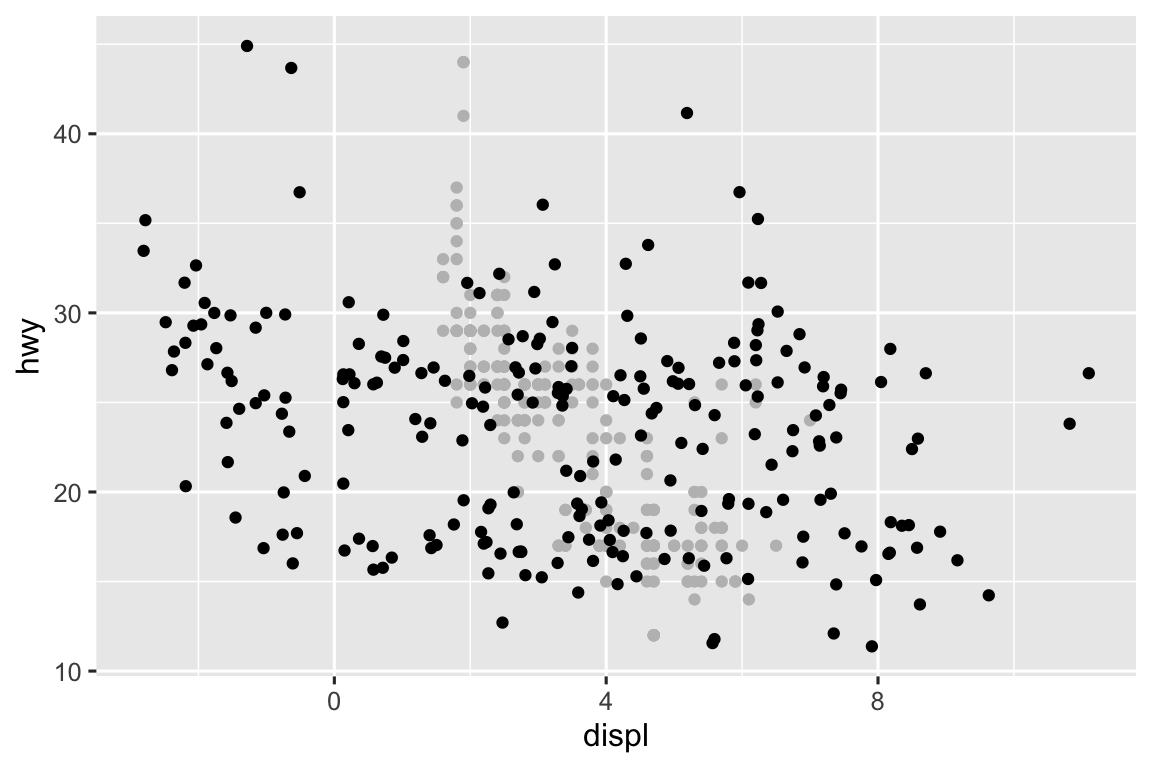
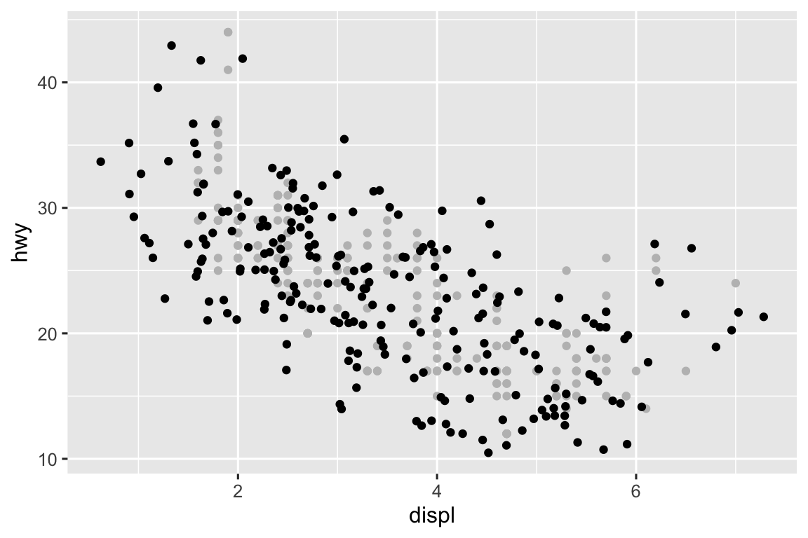
The
widthandheightparameters control the amount of horizontal and vertical displacement, recpectively. Higher values mean more displacement. In the plot below you can see the non-jittered points in gray and the jittered points in black.ggplot(mpg, aes(x = displ, y = hwy)) + geom_point(color = "gray") + geom_jitter(height = 1, width = 1) ggplot(mpg, aes(x = displ, y = hwy)) + geom_point(color = "gray") + geom_jitter(height = 1, width = 5) ggplot(mpg, aes(x = displ, y = hwy)) + geom_point(color = "gray") + geom_jitter(height = 5, width = 1)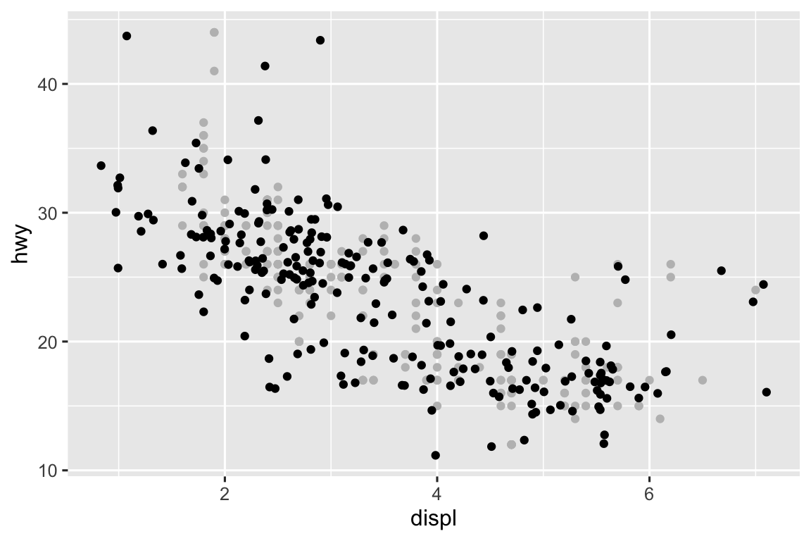
-
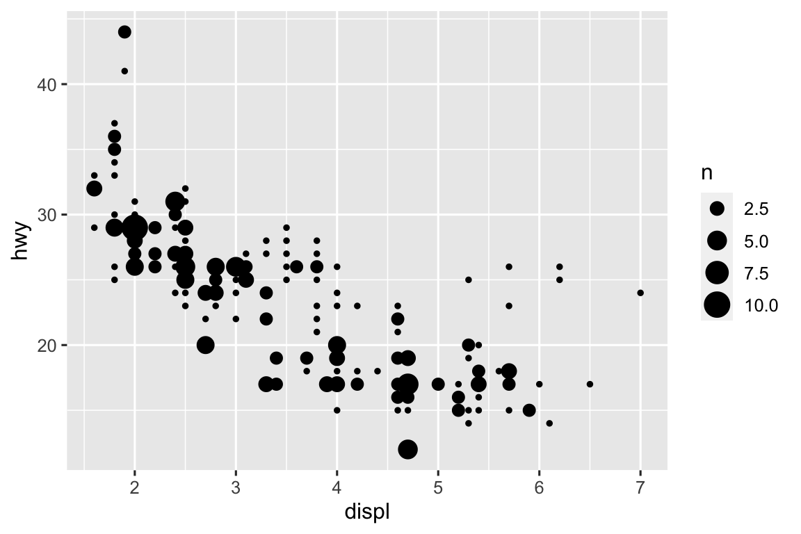
geom_jitter()adds random noise to the location of the points to avoid overplotting.geom_count()sizes the points based on the number of observations at a given location.ggplot(mpg, aes(x = displ, y = hwy)) + geom_jitter() ggplot(mpg, aes(x = displ, y = hwy)) + geom_count()
-
The default is position for
geom_boxplot()is"dodge2".ggplot(mpg, aes(x = cty, y = displ)) + geom_boxplot() #> Warning: Continuous x aesthetic #> ℹ did you forget `aes(group = ...)`? ggplot(mpg, aes(x = cty, y = displ)) + geom_boxplot(position = "dodge2") #> Warning: Continuous x aesthetic #> ℹ did you forget `aes(group = ...)`?

10.7.1 Exercises
-
We can turn a stacked bar chart into a pie chart by adding a
coord_polar()layer. coord_map()projects the portion of the earth you’re plotting onto a flat 2D plane using a given projection.coord_quickmap()is an approximation of this projection.-
geom_abline()adds a straight line aty = x, in other words, where highway mileage is equal to city mileage andcoord_fixed()uses a fixed scale coordinate system where the number of units on the x and y-axes are equivalent. Since all the points are above the line, the highway mileage is always greater than city mileage for these cars.ggplot(data = mpg, mapping = aes(x = cty, y = hwy)) + geom_point() + geom_abline() + coord_fixed()