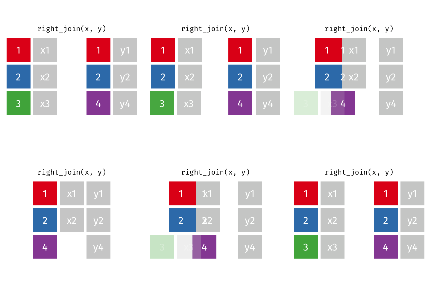
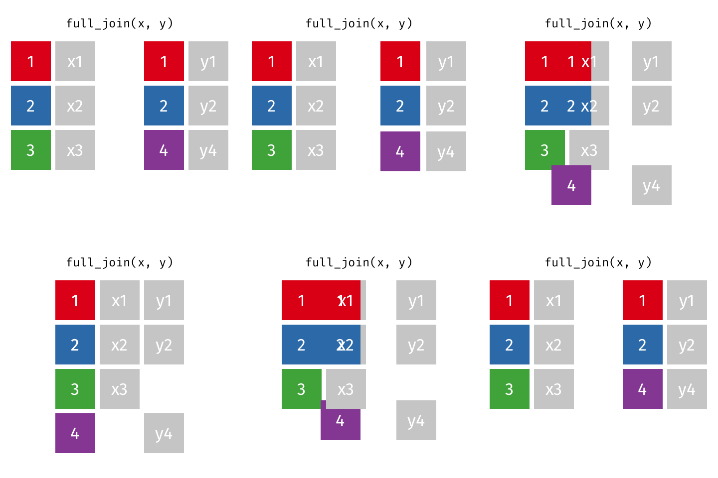
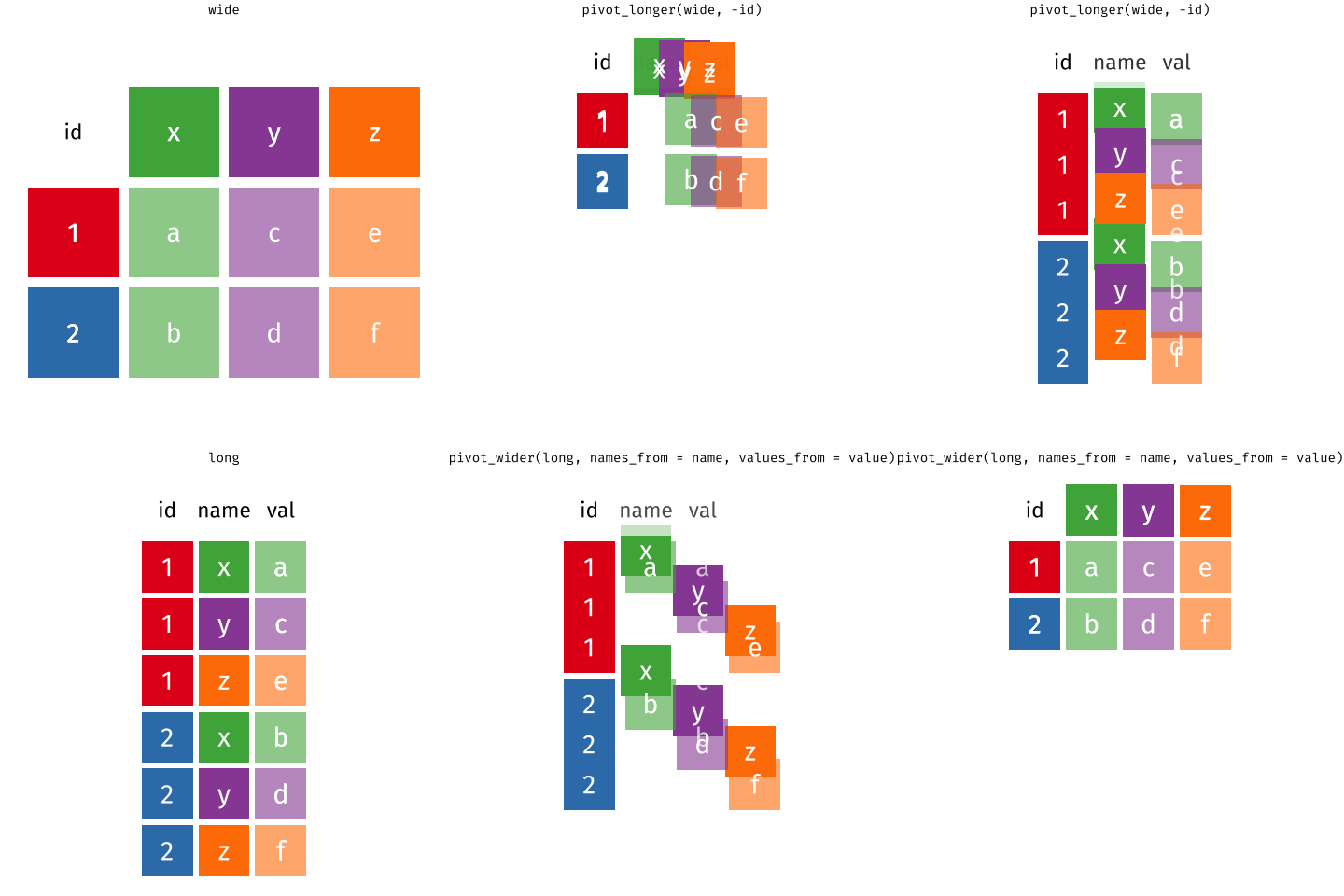
class: center, middle, inverse, title-slide # Tidy up your data science workflow with the tidyverse ## bit.ly/tidy-up-usfca --- class: middle, center # tidyverse --- ## tidyverse .pull-left[ - The **tidyverse** is an opinionated collection of R packages designed for data science. - All packages share an underlying design philosophy, grammar, and data structures. <br> <img src="img/tidyverse.png" width="50%" style="display: block; margin: auto;" /> ] .pull-right[ <img src="img/tidyverse-packages.png" width="100%" /> ] --- ## Tidy data ```r knitr::include_graphics("img/tidy-data.png") ``` <img src="img/tidy-data.png" width="205" /> 1. Each variable must have its own column. 1. Each observation must have its own row. 1. Each value must have its own cell. .footnote[ Source: R for Data Science. Grolemund and Wickham. ] --- ## Pipe operator > I want to find my keys, then start my car, then drive to work, then park my car. - Nested ```r park(drive(start_car(find("keys")), to = "work")) ``` - **Piped** ```r find("keys") %>% start_car() %>% drive(to = "work") %>% park() ``` --- class: middle, center # Fisheries of the world --- Fisheries and Aquaculture Department of the Food and Agriculture Organization of the United Nations collects data on fisheries production of countries. The (not-so-great) visualization belows shows the distribution of fishery harvest of countries for 2018, by capture and aquaculture. <br> .pull-left[ <img src="img/fisheries-data.png" width="100%" style="display: block; margin: auto;" /> ] .pull-right[ - Countries whose total harvest was less than 100,000 tons are not included in the visualization. - Source: [Fishing industry by country](https://en.wikipedia.org/wiki/Fishing_industry_by_country) ] --- .question[ What are some ways you would improve this visualization? ] <img src="img/fisheries.png" width="80%" style="display: block; margin: auto;" /> --- ## Get the data ```r names(fisheries) ``` ``` ## [1] "country" "capture" "aquaculture" "total" "continent" ## [6] "aquaculture_perc" ``` --- ## Inspect the data .midi[ ```r fisheries ``` ``` ## # A tibble: 68 x 6 ## country capture aquaculture total continent aquaculture_perc ## <chr> <dbl> <dbl> <dbl> <chr> <dbl> ## 1 Algeria 126259 368 126627 Africa 0.00291 ## 2 Argentina 931472 2430 933902 Americas 0.00260 ## 3 Australia 245935 47087 293022 Oceania 0.161 ## 4 Bangladesh 1333866 882091 2215957 Asia 0.398 ## 5 Brazil 750283 257783 1008066 Americas 0.256 ## 6 Cambodia 384000 26000 410000 Asia 0.0634 ## 7 Canada 1080982 154083 1235065 Americas 0.125 ## 8 Chile 4330325 698214 5028539 Americas 0.139 ## 9 Colombia 121000 60072 181072 Americas 0.332 ## 10 Congo, Democratic Republic of the 220000 2965 222965 Africa 0.0133 ## # … with 58 more rows ``` ] --- ## Data prep Filter out countries whose total harvest was less than 100,000 tons since they are not included in the visualization: .pull-left[ ```r fisheries <- fisheries %>% mutate(total = capture + aquaculture) %>% filter(total > 100000) ``` ] .pull-right[ ```r fisheries ``` ``` ## # A tibble: 68 x 6 ## country capture aquaculture total continent aquaculture_perc ## <chr> <dbl> <dbl> <dbl> <chr> <dbl> ## 1 Algeria 126259 368 126627 Africa 0.00291 ## 2 Argentina 931472 2430 933902 Americas 0.00260 ## 3 Australia 245935 47087 293022 Oceania 0.161 ## 4 Bangladesh 1333866 882091 2215957 Asia 0.398 ## 5 Brazil 750283 257783 1008066 Americas 0.256 ## 6 Cambodia 384000 26000 410000 Asia 0.0634 ## 7 Canada 1080982 154083 1235065 Americas 0.125 ## 8 Chile 4330325 698214 5028539 Americas 0.139 ## 9 Colombia 121000 60072 181072 Americas 0.332 ## 10 Congo, Democratic Republic of the 220000 2965 222965 Africa 0.0133 ## # … with 58 more rows ``` ] --- ## Load continent data ```r continents <- read_csv("data/continents.csv") ``` --- class: center, middle # Data joins --- .pull-left[ ```r fisheries %>% select(country) ``` ``` ## # A tibble: 68 x 1 ## country ## <chr> ## 1 Algeria ## 2 Argentina ## 3 Australia ## 4 Bangladesh ## 5 Brazil ## 6 Cambodia ## 7 Canada ## 8 Chile ## 9 Colombia ## 10 Congo, Democratic Republic of the ## # … with 58 more rows ``` ] .pull-right[ ```r continents ``` ``` ## # A tibble: 245 x 2 ## country continent ## <chr> <chr> ## 1 Afghanistan Asia ## 2 Åland Islands Europe ## 3 Albania Europe ## 4 Algeria Africa ## 5 American Samoa Oceania ## 6 Andorra Europe ## 7 Angola Africa ## 8 Anguilla Americas ## 9 Antigua & Barbuda Americas ## 10 Argentina Americas ## # … with 235 more rows ``` ] --- ## Joining data frames ``` something_join(x, y) ``` - `inner_join()`: all rows from x where there are matching values in y, return all combination of multiple matches in the case of multiple matches - `left_join()`: all rows from x - `right_join()`: all rows from y - `full_join()`: all rows from both x and y - `anti_join()`: return all rows from x where there are not matching values in y, never duplicate rows of x - ... --- ## Setup For the next few slides... .pull-left[ ```r x ``` ``` ## # A tibble: 3 x 1 ## value ## <dbl> ## 1 1 ## 2 2 ## 3 3 ``` ] .pull-right[ ```r y ``` ``` ## # A tibble: 3 x 1 ## value ## <dbl> ## 1 1 ## 2 2 ## 3 4 ``` ] --- ## `inner_join()` .pull-left[ ```r inner_join(x, y) ``` ``` ## Joining, by = "value" ``` ``` ## # A tibble: 2 x 1 ## value ## <dbl> ## 1 1 ## 2 2 ``` ] .pull-right[ <!-- --> ] --- ## `left_join()` .pull-left[ ```r left_join(x, y) ``` ``` ## Joining, by = "value" ``` ``` ## # A tibble: 3 x 1 ## value ## <dbl> ## 1 1 ## 2 2 ## 3 3 ``` ] .pull-right[ <!-- --> ] --- ## `right_join()` .pull-left[ ```r right_join(x, y) ``` ``` ## Joining, by = "value" ``` ``` ## # A tibble: 3 x 1 ## value ## <dbl> ## 1 1 ## 2 2 ## 3 4 ``` ] .pull-right[ <!-- --> ] --- ## `full_join()` .pull-left[ ```r full_join(x, y) ``` ``` ## Joining, by = "value" ``` ``` ## # A tibble: 4 x 1 ## value ## <dbl> ## 1 1 ## 2 2 ## 3 3 ## 4 4 ``` ] .pull-right[ <!-- --> ] --- ## `anti_join()` .pull-left[ ```r anti_join(x, y) ``` ``` ## Joining, by = "value" ``` ``` ## # A tibble: 1 x 1 ## value ## <dbl> ## 1 3 ``` ] .pull-right[ <!-- --> ] --- .question[ We want to keep all rows and columns from `fisheries` and add a column for corresponding continents. Which join function should we use? ] .pull-left[ ```r fisheries %>% select(country) ``` ``` ## # A tibble: 68 x 1 ## country ## <chr> ## 1 Algeria ## 2 Argentina ## 3 Australia ## 4 Bangladesh ## 5 Brazil ## 6 Cambodia ## 7 Canada ## 8 Chile ## 9 Colombia ## 10 Congo, Democratic Republic of the ## # … with 58 more rows ``` ] .pull-right[ ```r continents ``` ``` ## # A tibble: 245 x 2 ## country continent ## <chr> <chr> ## 1 Afghanistan Asia ## 2 Åland Islands Europe ## 3 Albania Europe ## 4 Algeria Africa ## 5 American Samoa Oceania ## 6 Andorra Europe ## 7 Angola Africa ## 8 Anguilla Americas ## 9 Antigua & Barbuda Americas ## 10 Argentina Americas ## # … with 235 more rows ``` ] --- ## Join fisheries and continents ```r fisheries <- left_join(fisheries, continents) ``` ``` ## Joining, by = c("country", "continent") ``` -- .question[ How does `left_join()` know to join the two data frames by `country`? ] Hint: - Variables in the original fisheries dataset: ``` ## [1] "country" "capture" "aquaculture" "total" "aquaculture_perc" ``` - Variables in the continents dataset: ``` ## [1] "country" "continent" ``` --- ## Check the data ```r fisheries %>% filter(is.na(continent)) ``` ``` ## # A tibble: 0 x 6 ## # … with 6 variables: country <chr>, capture <dbl>, aquaculture <dbl>, total <dbl>, ## # continent <chr>, aquaculture_perc <dbl> ``` --- ## Implement fixes ```r fisheries <- fisheries %>% mutate(continent = case_when( country == "Congo, Democratic Republic of the" ~ "Africa", country == "Hong Kong" ~ "Asia", country == "Myanmar" ~ "Asia", country == "People's Republic of China" ~ "Asia", country == "Russian Federation" ~ "Asia", country == "Taiwan (Republic of China)" ~ "Asia", country == "UK" ~ "Europe", country == "USA" ~ "Americas", TRUE ~ continent ) ) ``` --- ## ...and check again ```r fisheries %>% filter(is.na(continent)) ``` ``` ## # A tibble: 0 x 6 ## # … with 6 variables: country <chr>, capture <dbl>, aquaculture <dbl>, total <dbl>, ## # continent <chr>, aquaculture_perc <dbl> ``` --- ## Remove "Other" ```r fisheries <- fisheries %>% filter(!is.na(continent)) ``` --- .question[ What does the following code do? ] ```r fisheries <- fisheries %>% mutate(aquaculture_perc = aquaculture / total) ``` --- ## Continent-level statistics ```r fisheries_summary <- fisheries %>% group_by(continent) %>% summarise( min_ap = min(aquaculture_perc), mean_ap = mean(aquaculture_perc), max_ap = max(aquaculture_perc) ) fisheries_summary ``` ``` ## # A tibble: 5 x 4 ## continent min_ap mean_ap max_ap ## <chr> <dbl> <dbl> <dbl> ## 1 Africa 0.0000316 0.0568 0.607 ## 2 Americas 0.000373 0.106 0.332 ## 3 Asia 0.00115 0.217 0.655 ## 4 Europe 0.00359 0.158 0.534 ## 5 Oceania 0.00000662 0.108 0.164 ``` --- ## Visualize continent summary stats ```r ggplot(fisheries_summary, aes(x = continent, y = mean_ap)) + geom_col() ``` <img src="tidy-up_files/figure-html/unnamed-chunk-41-1.png" width="2100" /> --- ## Improve visualization .panelset[ .panel[.panel-name[Plot] <img src="tidy-up_files/figure-html/continent-bars-1.png" width="90%" /> ] .panel[.panel-name[Code] ```r ggplot(fisheries_summary, aes( * y = fct_reorder(continent, mean_ap), x = mean_ap) ) + geom_col() + * scale_x_continuous(labels = label_percent(accuracy = 1)) + * labs( * x = NULL, y = NULL, * title = "Average share of aquaculture by continent", * subtitle = "out of total fisheries harvest, 2018", * caption = "Source: bit.ly/2VrawTt" * ) + * theme_minimal() ``` ] ] --- class: center, middle # Instructional staff employment trends --- The American Association of University Professors (AAUP) is a nonprofit membership association of faculty and other academic professionals. [This report](https://www.aaup.org/sites/default/files/files/AAUP_Report_InstrStaff-75-11_apr2013.pdf) by the AAUP shows trends in instructional staff employees between 1975 and 2011, and contains an image very similar to the one given below. <img src="img/staff-employment.png" width="80%" style="display: block; margin: auto;" /> --- ## Data Each row in this dataset represents a faculty type, and the columns are the years for which we have data. The values are percentage of hires of that type of faculty for each year. ```r staff <- read_csv("data/instructional-staff.csv") staff ``` ``` ## # A tibble: 5 x 12 ## faculty_type `1975` `1989` `1993` `1995` `1999` `2001` `2003` `2005` `2007` `2009` `2011` ## <chr> <dbl> <dbl> <dbl> <dbl> <dbl> <dbl> <dbl> <dbl> <dbl> <dbl> <dbl> ## 1 Full-Time Tenured Fa… 29 27.6 25 24.8 21.8 20.3 19.3 17.8 17.2 16.8 16.7 ## 2 Full-Time Tenure-Tra… 16.1 11.4 10.2 9.6 8.9 9.2 8.8 8.2 8 7.6 7.4 ## 3 Full-Time Non-Tenure… 10.3 14.1 13.6 13.6 15.2 15.5 15 14.8 14.9 15.1 15.4 ## 4 Part-Time Faculty 24 30.4 33.1 33.2 35.5 36 37 39.3 40.5 41.1 41.3 ## 5 Graduate Student Emp… 20.5 16.5 18.1 18.8 18.7 19 20 19.9 19.5 19.4 19.3 ``` --- ## Recreate the visualization In order to recreate this visualization we need to first reshape the data to have one variable for faculty type and one variable for year. In other words, we will convert the data from the long format to wide format. But before we do so... .question[ If the long data will have a row for each year/faculty type combination, and there are 5 faculty types and 11 years of data, how many rows will the data have? ] --- class: center, middle <img src="img/pivot.gif" width="80%" style="display: block; margin: auto;" /> --- ## `pivot_*()` functions <!-- --> --- ## `pivot_longer()` ```r pivot_longer(data, cols, names_to = "name", values_to = "value") ``` - The first argument is `data` as usual. - The second argument, `cols`, is where you specify which columns to pivot into longer format -- in this case all columns except for the `faculty_type` - The third argument, `names_to`, is a string specifying the name of the column to create from the data stored in the column names of data -- in this case `year` - The fourth argument, `values_to`, is a string specifying the name of the column to create from the data stored in cell values, in this case `percentage` --- ## Pivot staff data .midi[ ```r staff_long <- staff %>% pivot_longer(cols = -faculty_type, names_to = "year", values_to = "percentage") %>% mutate(percentage = as.numeric(percentage)) staff_long ``` ``` ## # A tibble: 55 x 3 ## faculty_type year percentage ## <chr> <chr> <dbl> ## 1 Full-Time Tenured Faculty 1975 29 ## 2 Full-Time Tenured Faculty 1989 27.6 ## 3 Full-Time Tenured Faculty 1993 25 ## 4 Full-Time Tenured Faculty 1995 24.8 ## 5 Full-Time Tenured Faculty 1999 21.8 ## 6 Full-Time Tenured Faculty 2001 20.3 ## 7 Full-Time Tenured Faculty 2003 19.3 ## 8 Full-Time Tenured Faculty 2005 17.8 ## 9 Full-Time Tenured Faculty 2007 17.2 ## 10 Full-Time Tenured Faculty 2009 16.8 ## # … with 45 more rows ``` ] --- .question[ This doesn't look quite right, how would you fix it? ] .small[ ```r staff_long %>% ggplot(aes(x = percentage, y = year, color = faculty_type)) + geom_col(position = "dodge") ``` <img src="tidy-up_files/figure-html/unnamed-chunk-48-1.png" width="1500" /> ] --- .midi[ ```r staff_long %>% ggplot(aes(x = percentage, y = year, fill = faculty_type)) + geom_col(position = "dodge") ``` <img src="tidy-up_files/figure-html/unnamed-chunk-49-1.png" width="1500" /> ] --- ## Some improvement... .midi[ ```r staff_long %>% ggplot(aes(x = percentage, y = year, fill = faculty_type)) + geom_col() ``` <img src="tidy-up_files/figure-html/unnamed-chunk-50-1.png" width="1500" /> ] --- ## More improvement .midi[ ```r staff_long %>% ggplot(aes(x = year, y = percentage, group = faculty_type, color = faculty_type)) + geom_line() + theme_minimal() ``` <img src="tidy-up_files/figure-html/unnamed-chunk-51-1.png" width="100%" /> ] --- .panelset[ .panel[.panel-name[Plot] <img src="tidy-up_files/figure-html/instructor-lines-1.png" width="100%" /> ] .panel[.panel-name[Code] ```r staff_long %>% * mutate( * part_time = if_else(faculty_type == "Part-Time Faculty", * "Part-Time Faculty", "Other Faculty"), * year = as.numeric(year) * ) %>% ggplot(aes(x = year, y = percentage/100, group = faculty_type, color = part_time)) + geom_line() + * scale_color_manual(values = c("gray", "red")) + * scale_y_continuous(labels = label_percent(accuracy = 1)) + theme_minimal() + labs( title = "Instructional staff employment trends", x = "Year", y = "Percentage", color = NULL ) + * theme(legend.position = "bottom") ``` ] ] --- ## Learn more - tidyverse homepage: https://www.tidyverse.org/learn - RStudio primers: https://rstudio.cloud/learn/primers - Introduction to Modern Statistics tutorials: https://openintrostat.github.io/ims-tutorials --- ## Stay connected and current - R Ladies: https://rladies.org - TidyTuesday: https://github.com/rfordatascience/tidytuesday - R Weekly: https://rweekly.org