class: center, middle, inverse, title-slide # 01 <br> curriculum design ## 🍰 start with cake! <br> 🔗 <a href="https://bit.ly/teach-ds-wsc">bit.ly/teach-ds-wsc</a> ### <br> dr. mine çetinkaya-rundel <br> dr. colin rundel ### 23 june 2021 --- class: middle, inverse ## Imagine you’re new to baking, and you’re in a baking class. I’m going to present two options for starting the class. Which one gives you **better sense** of the final product? --- background-image: url("img/cake-ingredients.png") background-size: cover >### Today we’re going to make a >### pineapple and coconut sandwich >### sponge cake with these ingredients --- background-image: url("img/cake-result.png") background-size: cover >### Today we’re going to >### make a pineapple and >### coconut sandwich >### sponge cake with >### these ingredients --- class: middle, inverse ## .hand[ OK, hold on to that thought! ] --- class: middle .pull-left-narrow[ .huge-blue-number[2] ] .pull-right-wide[ .larger[ design foundations ] ] --- ### .pink[ design foundation 1: ] ## backwards design Set goals for educational curriculum before choosing instructional methods + forms of assessment 1. Identify desired results 1. Determine acceptable evidence 1. Plan learning experiences and instruction .footnote[ Wiggins, Grant P., Grant Wiggins, and Jay McTighe. Understanding by design. Ascd, 2005. ] --- ## designing backwards 1. Identify desired **data analysis** results 1. Determine **building blocks** 1. Plan learning experiences and instruction --- ### .pink[ design foundation 2: ] ## 2016 Guidelines for Assessment and Instruction in Statistics Education (GAISE) 1. Teach statistical thinking. - Teach statistics as an investigative process of problem-solving and decision making. - Give students experience with multivariable thinking [...] to answer challenging questions that require them to investigate and explore relationships among many variables. 1. Focus on conceptual understanding. 1. Integrate real data with a context and purpose. 1. Foster active learning. 1. Use technology to explore concepts and analyse data. 1. Use assessments to improve and evaluate student learning. .footnote[ amstat.org/asa/files/pdfs/GAISE/GaiseCollege_Full.pdf ] --- ## 2016 GAISE .pull-left-wide[ 1. Teach **statistical thinking**. - Teach statistics as an investigative process of problem-solving and decision making. - Give students experience with multivariable thinking [...] to answer challenging questions that require them to investigate and explore relationships among many variables. 1. Focus on conceptual understanding. 1. Integrate real data with a context and purpose. 1. Foster active learning. 1. Use technology to explore concepts and analyse data. 1. Use assessments to improve and evaluate student learning. ] .pull-right-narrow[ .hand-blue[ NOT a commonly used subset of tests and intervals and produce them with hand calculations ] ] --- ## 2016 GAISE .pull-left-wide[ 1. Teach statistical thinking. - Teach statistics as an investigative process of problem-solving and decision making. - Give students experience with multivariable thinking [...] to answer challenging questions that require them to **investigate and explore relationships among many variables**. 1. Focus on conceptual understanding. 1. Integrate real data with a context and purpose. 1. Foster active learning. 1. Use technology to explore concepts and analyse data. 1. Use assessments to improve and evaluate student learning. ] .pull-right-narrow[ .hand-blue[ Multivariate analysis requires the use of computing ] ] --- ## 2016 GAISE .pull-left-wide[ 1. Teach statistical thinking. - Teach statistics as an investigative process of problem-solving and decision making. - Give students experience with multivariable thinking [...] to answer challenging questions that require them to investigate and explore relationships among many variables. 1. Focus on conceptual understanding. 1. Integrate real data with a context and purpose. 1. Foster active learning. 1. **Use technology** to explore concepts and analyse data. 1. Use assessments to improve and evaluate student learning. ] .pull-right-narrow[ .hand-blue[ NOT use technology that is only applicable in the intro course or that doesn’t follow good science principles ] ] --- ## 2016 GAISE .pull-left-wide[ 1. Teach statistical thinking. - Teach statistics as an investigative process of problem-solving and decision making. - Give students experience with multivariable thinking [...] to answer challenging questions that require them to investigate and explore relationships among many variables. 1. Focus on conceptual understanding. 1. Integrate real data with a context and purpose. 1. Foster active learning. 1. Use technology to explore concepts and **analyse data**. 1. Use assessments to improve and evaluate student learning. ] .pull-right-narrow[ .hand-blue[ Data analysis isn’t just inference and modelling, it’s also data importing, cleaning, preparation, exploration, and visualization ] ] --- class: middle, inverse ## .hand[ So, where do we go with all this? ] --- <div id="htmlwidget-cd730d7db73d03839427" style="width:100%;height:60%;" class="widgetframe html-widget"></div> <script type="application/json" data-for="htmlwidget-cd730d7db73d03839427">{"x":{"url":"01-curriculum-design_files/figure-html//widgets/widget_topic-flow-diagram.html","options":{"xdomain":"*","allowfullscreen":false,"lazyload":false}},"evals":[],"jsHooks":[]}</script> --- .pull-left-narrow[ .huge-blue-number[5] ] .pull-right-wide[ .larger[ design principles ] ] --- class: middle, inverse ## Which kitchen would you rather bake in? .pull-left[ <img src="img/kitchen-inrepair.png" title="A kitchen in shambles that needs repair." alt="A kitchen in shambles that needs repair." /> ] .pull-right[ <img src="img/kitchen-built.png" title="A neat and tidy kitchen that needs no repair." alt="A neat and tidy kitchen that needs no repair." /> ] --- class: middle, inverse ## Which kitchen would you rather bake in? .pull-left[ <!-- --> ] .pull-right[ <!-- --> ] --- .pull-left-wide[ .right[ .larger[ cherish day one ] ] ] .pull-right-narrow[ .huge-pink-number[1] ] --- .pull-left[ <img src="img/kitchen-inrepair.png" title="A kitchen in shambles that needs repair." alt="A kitchen in shambles that needs repair." height="250" /> - Install R - Install RStudio - Install the following packages: - tidyverse - rmarkdown - ... - Load these packages - Install git ] .pull-right[ <img src="img/kitchen-built.png" title="A neat and tidy kitchen that needs no repair." alt="A neat and tidy kitchen that needs no repair." height="250" /> - Go to rstudio.cloud (or some other server based solution) - Log in with your ID & pass ```r > hello R! ``` ] --- class: middle, center [minecr.shinyapps.io/unvotes](https://minecr.shinyapps.io/unvotes/) [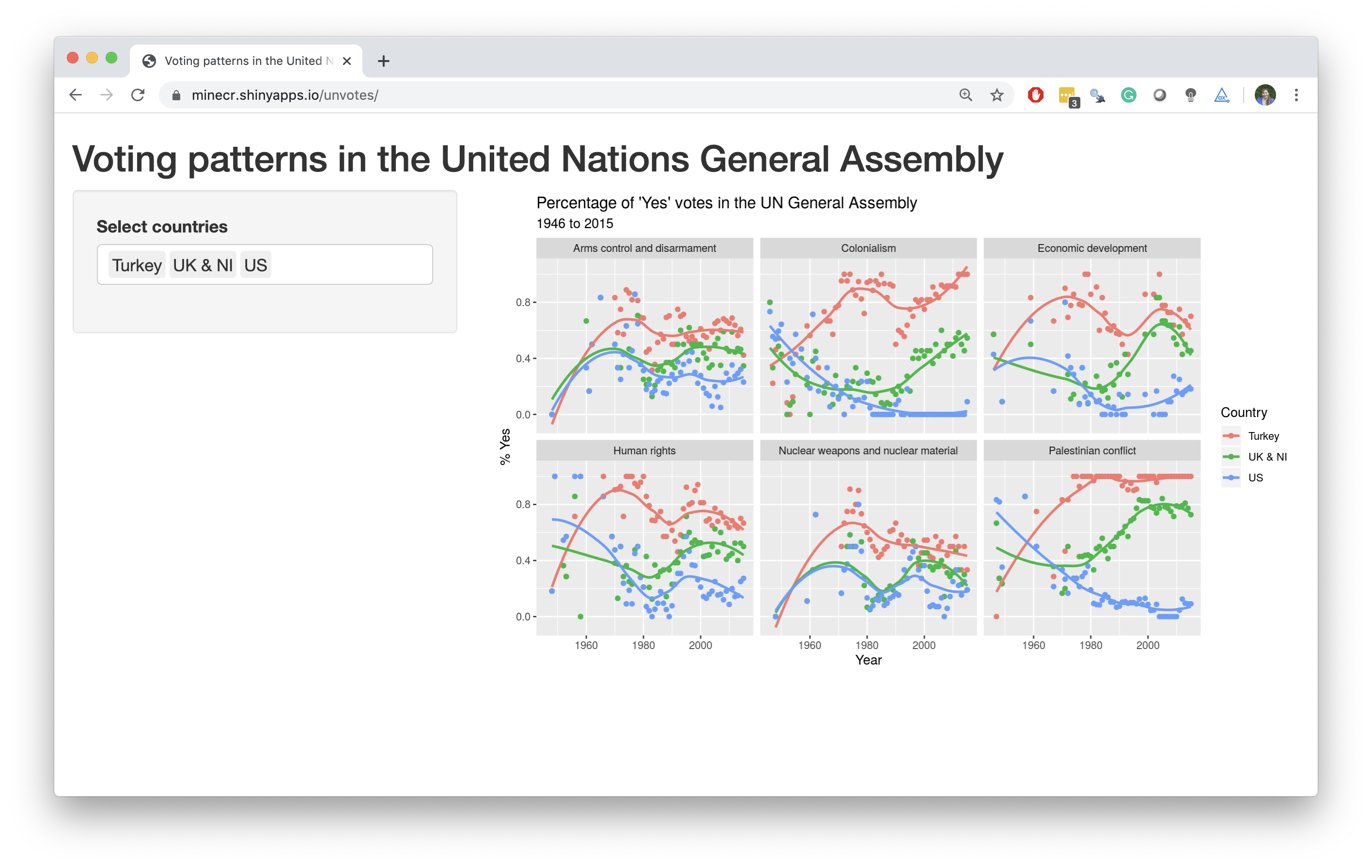<!-- -->](https://minecr.shinyapps.io/unvotes/) --- .your-turn[ - Go to [bit.ly/teach-ds-wsc-cloud](https://bit.ly/teach-ds-wsc-cloud) to join the RStudio Cloud workspace for this workshop - Start the **assignment** called **01 - Curriculum Design** - Open the R Markdown document called `un-votes.Rmd`, knit the document, view the result - Then, change "Turkey" to another country, and knit again. - When you're done with the exercise, discuss with your neighbours: - What worked? What didn't? - What would you add to the instructions? What would you take away? ] <div class="countdown" id="timer_60d28def" style="right:0;bottom:0;" data-warnwhen="0"> <code class="countdown-time"><span class="countdown-digits minutes">05</span><span class="countdown-digits colon">:</span><span class="countdown-digits seconds">00</span></code> </div> --- class: middle, inverse ## How do you prefer your cake recipes? Words only, or words & pictures? .pull-left[ <img src="img/recipe-picture.png" title="A recipe with words and pictures." alt="A recipe with words and pictures." /> ] .pull-right[ <img src="img/recipe-words.png" title="A recipe with words only." alt="A recipe with words only." /> ] --- class: middle, inverse ## How do you prefer your cake recipes? Words only, or words & pictures? .pull-left[ <!-- --> ] .pull-right[ <!-- --> ] --- .pull-left-wide[ .right[ .larger[ start with cake ] ] ] .pull-right-narrow[ .huge-pink-number[2] ] --- .pull-left[ <img src="img/recipe-picture.png" title="A recipe with words and pictures." alt="A recipe with words and pictures." width="250" height="150" style="display: block; margin: auto;" /> - Open today's demo project - Knit the document and discuss the visualisation you made with your neighbor - Then, change `Turkey` to a different country, and plot again ] .pull-right[ <img src="img/recipe-words.png" title="A recipe with words only." alt="A recipe with words only." width="250" height="150" style="display: block; margin: auto;" /> .small[ ```r x <- 8 y <- "monkey" z <- FALSE class(x) ``` ``` ## [1] "numeric" ``` ```r class(y) ``` ``` ## [1] "character" ``` ```r class(z) ``` ``` ## [1] "logical" ``` ] ] --- class: middle ## .hand[ with great examples, ] ## .hand[ comes a great amount of code... ] --- class: middle ## .hand[ but let’s focus on the task at hand... ] - Open today's demo project - Knit the document and discuss the visualisation you made with your neighbor - Then, **.pink[ change `Turkey` to a different country, and plot again]** --- .midi[ ```r un_votes %>% filter(country %in% c("United States", "Turkey")) %>% inner_join(un_roll_calls, by = "rcid") %>% inner_join(un_roll_call_issues, by = "rcid") %>% group_by(country, year = year(date), issue) %>% summarize( votes = n(), perc_yes = mean(vote == "yes") ) %>% filter(votes > 5) %>% ggplot(mapping = aes(x = year, y = perc_yes, color = country)) + geom_point() + geom_smooth(method = "loess", se = FALSE) + facet_wrap(~ issue) + labs( title = "Percentage of Yes votes in the UN General Assembly", subtitle = "1946 to 2015", y = "% Yes", x = "Year", color = "Country" ) ``` ] --- .midi[ ```r un_votes %>% * filter(country %in% c("United States", "Turkey")) %>% inner_join(un_roll_calls, by = "rcid") %>% inner_join(un_roll_call_issues, by = "rcid") %>% group_by(country, year = year(date), issue) %>% summarize( votes = n(), perc_yes = mean(vote == "yes") ) %>% filter(votes > 5) %>% ggplot(mapping = aes(x = year, y = perc_yes, color = country)) + geom_point() + geom_smooth(method = "loess", se = FALSE) + facet_wrap(~ issue) + labs( title = "Percentage of Yes votes in the UN General Assembly", subtitle = "1946 to 2015", y = "% Yes", x = "Year", color = "Country" ) ``` ] --- .midi[ ```r un_votes %>% * filter(country %in% c("United States", "France")) %>% inner_join(un_roll_calls, by = "rcid") %>% inner_join(un_roll_call_issues, by = "rcid") %>% group_by(country, year = year(date), issue) %>% summarize( votes = n(), perc_yes = mean(vote == "yes") ) %>% filter(votes > 5) %>% ggplot(mapping = aes(x = year, y = perc_yes, color = country)) + geom_point() + geom_smooth(method = "loess", se = FALSE) + facet_wrap(~ issue) + labs( title = "Percentage of Yes votes in the UN General Assembly", subtitle = "1946 to 2015", y = "% Yes", x = "Year", color = "Country" ) ``` ] --- class: middle, inverse ## Which motivates you more to learn how to cook: perfectly chopped onions or ratatouille? .pull-left[ <img src="img/chop-onions.png" title="Knife and chopped onions." alt="Knife and chopped onions." /> ] .pull-right[ <img src="img/make-ratatouille.png" title="A plate of ratatouille." alt="A plate of ratatouille." /> ] --- class: middle, inverse ## Which motivates you more to learn how to cook: perfectly chopped onions or ratatouille? .pull-left[ <!-- --> ] .pull-right[ <!-- --> ] --- .pull-left-wide[ .right[ .larger[ skip baby steps ] ] ] .pull-right-narrow[ .huge-pink-number[3] ] --- .pull-left[ <img src="img/chop-onions.png" title="Knife and chopped onions." alt="Knife and chopped onions." width="250" height="150" style="display: block; margin: auto;" /> <!-- --> ] .pull-right[ <img src="img/make-ratatouille.png" title="A plate of ratatouille." alt="A plate of ratatouille." width="250" height="120" style="display: block; margin: auto;" /> .small[ <img src="01-curriculum-design_files/figure-html/unvotes-multivariate-1.png" width="100%" /> ] ] --- class: middle ## .hand[ non-trivial examples can be motivating, ] ## .hand[ but need to avoid ] 👇 .pull-left[ <img src="img/owl-step1.png" title="Step 1 of drawing an owl is two circles, one for head and one for body." alt="Step 1 of drawing an owl is two circles, one for head and one for body." width="250" height="390" style="display: block; margin: auto 0 auto auto;" /> ] .pull-right[ <img src="img/owl-step2.png" title="Step 2 of drawing an owl is drawing the entire owl, with all details." alt="Step 2 of drawing an owl is drawing the entire owl, with all details." width="250" height="390" style="display: block; margin: auto auto auto 0;" /> ] --- class: middle .center[ .three-column[ <img src="img/owl-step1.png" width="250" height="400" /> ] .three-column[ ## .center[ .hand[ scaffold + layer ] ] ] .three-column[ <img src="img/owl-step2.png" width="250" height="400" /> ] ] --- .discussion[ The following is used to create the multivariate visualisation from earlier. How much of the code would you show/hide when just starting teaching ggplot2? ] .small[ ```r un_votes %>% filter(country %in% c("United States")) %>% inner_join(un_roll_calls, by = "rcid") %>% inner_join(un_roll_call_issues, by = "rcid") %>% mutate(importantvote = ifelse(importantvote == 0, "No", "Yes")) %>% ggplot(aes(y = importantvote, fill = vote)) + geom_bar(position = "fill") + facet_wrap(~ issue, ncol = 1) + labs( title = "How the US voted in the UN", subtitle = "By issue and importance of vote", x = "Important vote", y = "", fill = "Vote" ) + theme_minimal() + scale_fill_viridis_d(option = "E") ``` ] --- ## Designing code snippets for teaching - Write it out to your heart's desire and polish it -- - Then, split into three parts: - 📦 **Pre-process:** Required, but isn't directly connected to / far off from learning goals of current lesson - 💔 **Stash:** Not required, and not directly connected to learning goals of current lesson - Likely concepts that fit better into future lessons) - ✅ **Feature:** Heart of the lesson (and maybe a review of a previous lessons) - Finally, decide on the pace at which to scaffold and layer --- ## 📦 Pre-process We'll call the highlighted lines `us_votes` .small[ ```r *un_votes %>% * filter(country %in% c("United States")) %>% * inner_join(un_roll_calls, by = "rcid") %>% * inner_join(un_roll_call_issues, by = "rcid") %>% * mutate(importantvote = ifelse(importantvote == 0, "No", "Yes")) %>% ggplot(aes(y = importantvote, fill = vote)) + geom_bar(position = "fill") + facet_wrap(~ issue, ncol = 1) + labs( title = "How the US voted in the UN", subtitle = "By issue and importance of vote", x = "Important vote", y = "", fill = "Vote" ) + theme_minimal() + scale_fill_viridis_d(option = "E") ``` ] --- .small[ ```r us_votes ``` ``` ## # A tibble: 5,718 x 14 ## rcid country country_code vote session importantvote date unres amend para short ## <dbl> <chr> <chr> <fct> <dbl> <chr> <date> <chr> <int> <int> <chr> ## 1 6 United … US no 1 No 1946-01-04 R/1/… 0 0 DECLAR… ## 2 8 United … US no 1 No 1946-01-05 R/1/… 1 0 ECOSOC… ## 3 11 United … US yes 1 No 1946-02-05 R/1/… 0 0 TRUSTE… ## 4 11 United … US yes 1 No 1946-02-05 R/1/… 0 0 TRUSTE… ## 5 18 United … US no 1 No 1946-02-03 R/1/… 1 0 ECOSOC… ## 6 19 United … US yes 1 No 1946-02-03 R/1/… 0 0 ECOSOC… ## 7 24 United … US yes 1 No 1946-12-05 R/1/… 0 0 ECOSOC… ## 8 26 United … US no 1 No 1946-12-06 R/1/… 0 0 TRUSTE… ## 9 27 United … US yes 1 No 1946-12-06 R/1/… 0 0 NEW GU… ## 10 28 United … US yes 1 No 1946-12-06 R/1/… 0 0 RUANDA… ## # … with 5,708 more rows, and 3 more variables: descr <chr>, short_name <chr>, issue <fct> ``` ] --- ## 💔 **Stash:** .small[ ```r un_votes %>% filter(country %in% c("United States")) %>% inner_join(un_roll_calls, by = "rcid") %>% inner_join(un_roll_call_issues, by = "rcid") %>% mutate(importantvote = ifelse(importantvote == 0, "No", "Yes")) %>% ggplot(aes(y = importantvote, fill = vote)) + geom_bar(position = "fill") + facet_wrap(~ issue, ncol = 1) + labs( title = "How the US voted in the UN", subtitle = "By issue and importance of vote", x = "Important vote", y = "", fill = "Vote" ) + * theme_minimal() + * scale_fill_viridis_d(option = "E") ``` ] --- ## ✅ Feature ```r us_votes %>% ggplot(aes(y = importantvote, fill = vote)) + geom_bar(position = "fill") + facet_wrap(~ issue, ncol = 1) + labs( title = "How the US voted in the UN", subtitle = "By issue and importance of vote", x = "Important vote", y = "", fill = "Vote" ) ``` --- .pull-left[ ```r *ggplot(data = us_votes) ``` ] .pull-right[ <img src="01-curriculum-design_files/figure-html/unnamed-chunk-5-1.png" title="A plot with an empty background, no data shown." alt="A plot with an empty background, no data shown." width="100%" /> ] --- .pull-left[ .small[ ```r ggplot(data = us_votes, * mapping = aes(x = importantvote, * fill = vote)) ``` ] ] .pull-right[ <img src="01-curriculum-design_files/figure-html/unnamed-chunk-6-1.png" title="A frequency bar plot with whether the vote was considered important or not on the x-axis and bars filled with the vote (yes, no, or abstain)." alt="A frequency bar plot with whether the vote was considered important or not on the x-axis and bars filled with the vote (yes, no, or abstain)." width="100%" /> ] --- .pull-left[ .small[ ```r ggplot(data = us_votes, mapping = aes(x = importantvote, fill = vote)) + * geom_bar(position = "fill") ``` ] ] .pull-right[ <img src="01-curriculum-design_files/figure-html/unnamed-chunk-7-1.png" title="A relative frequency bar plot with whether the vote was considered important or not on the x-axis and bars filled with the vote (yes, no, or abstain)." alt="A relative frequency bar plot with whether the vote was considered important or not on the x-axis and bars filled with the vote (yes, no, or abstain)." width="100%" /> ] --- .pull-left[ .small[ ```r ggplot(data = us_votes, mapping = aes(x = importantvote, fill = vote)) + geom_bar(position = "fill") + * facet_wrap(~ issue, ncol = 1) ``` ] ] .pull-right[ <img src="01-curriculum-design_files/figure-html/unnamed-chunk-8-1.png" title="A relative frequency bar plot with whether the vote was considered important or not on the x-axis and bars filled with the vote (yes, no, or abstain), faceted by issue (colonialism, arms control and disarmament, economic development, human rights, Palestinian conflict, and nuclear weapons and nuclear material)." alt="A relative frequency bar plot with whether the vote was considered important or not on the x-axis and bars filled with the vote (yes, no, or abstain), faceted by issue (colonialism, arms control and disarmament, economic development, human rights, Palestinian conflict, and nuclear weapons and nuclear material)." width="100%" /> ] --- .pull-left[ .small[ ```r ggplot(data = us_votes, mapping = aes(x = importantvote, fill = vote)) + geom_bar(position = "fill") + facet_wrap(~ issue, ncol = 1) + * labs( * title = "How the US voted in the UN", * subtitle = "By issue and importance of vote", * x = "Important vote", * y = "" * ) ``` ] ] .pull-right[ <img src="01-curriculum-design_files/figure-html/unnamed-chunk-9-1.png" title="A relative frequency bar plot with whether the vote was considered important or not on the x-axis and bars filled with the vote (yes, no, or abstain), faceted by issue (colonialism, arms control and disarmament, economic development, human rights, Palestinian conflict, and nuclear weapons and nuclear material). Plot also has a title and subtitle." alt="A relative frequency bar plot with whether the vote was considered important or not on the x-axis and bars filled with the vote (yes, no, or abstain), faceted by issue (colonialism, arms control and disarmament, economic development, human rights, Palestinian conflict, and nuclear weapons and nuclear material). Plot also has a title and subtitle." width="100%" /> ] --- .pull-left[ .small[ ```r ggplot(data = us_votes, mapping = aes(x = importantvote, fill = vote)) + geom_bar(position = "fill") + facet_wrap(~ issue, ncol = 1) + labs( title = "How the US voted in the UN", subtitle = "By issue and importance of vote", x = "Important vote", y = "", * fill = "Vote" ) ``` ] ] .pull-right[ <img src="01-curriculum-design_files/figure-html/unnamed-chunk-10-1.png" title="A relative frequency bar plot with whether the vote was considered important or not on the x-axis and bars filled with the vote (yes, no, or abstain), faceted by issue (colonialism, arms control and disarmament, economic development, human rights, Palestinian conflict, and nuclear weapons and nuclear material). Plot also has a title and subtitle and the legend label is customized." alt="A relative frequency bar plot with whether the vote was considered important or not on the x-axis and bars filled with the vote (yes, no, or abstain), faceted by issue (colonialism, arms control and disarmament, economic development, human rights, Palestinian conflict, and nuclear weapons and nuclear material). Plot also has a title and subtitle and the legend label is customized." width="100%" /> ] --- .pull-left[ .small[ ```r ggplot(data = us_votes, mapping = aes(y = importantvote, fill = vote)) + geom_bar(position = "fill") + facet_wrap(~ issue, ncol = 1) + labs( title = "How the US voted in the UN", subtitle = "By issue and importance of vote", x = "Important vote", y = "", fill = "Vote" ) ``` ] ] .pull-right[ <img src="01-curriculum-design_files/figure-html/unnamed-chunk-11-1.png" title="A relative frequency bar plot with whether the vote was considered important or not on the y-axis and bars filled with the vote (yes, no, or abstain), faceted by issue (colonialism, arms control and disarmament, economic development, human rights, Palestinian conflict, and nuclear weapons and nuclear material). Plot also has a title and subtitle and the legend label is customized." alt="A relative frequency bar plot with whether the vote was considered important or not on the y-axis and bars filled with the vote (yes, no, or abstain), faceted by issue (colonialism, arms control and disarmament, economic development, human rights, Palestinian conflict, and nuclear weapons and nuclear material). Plot also has a title and subtitle and the legend label is customized." width="100%" /> ] --- ## ~~Skip~~ Re-insert baby steps <img src="img/learnr-visualise.png" title="Screenshot of a learnr tutorial." alt="Screenshot of a learnr tutorial." /> --- class: middle, inverse ## Which is more likely to appeal to someone who has never tried broccoli? .pull-left[ <img src="img/broccoli-raw.png" title="Raw broccoli." alt="Raw broccoli." /> ] .pull-right[ <img src="img/broccoli-cooked.png" title="Cooked broccoli in a noodle dish." alt="Cooked broccoli in a noodle dish." /> ] --- class: middle, inverse ## Which is more likely to appeal to someone who has never tried broccoli? .pull-left[ <!-- --> ] .pull-right[ <!-- --> ] --- .pull-left-wide[ .right[ .larger[ hide the veggies ] ] ] .pull-right-narrow[ .huge-pink-number[4] ] --- .pull-left-narrow[ <img src="img/broccoli-raw.png" title="Raw broccoli." alt="Raw broccoli." width="250" height="150" style="display: block; margin: auto;" /> Today we're going to do web scraping - Using the **rvest** package - And with the help of *regular expressions* ] .pull-right-wide[ <img src="img/broccoli-cooked.png" title="Cooked broccoli in a noodle dish." alt="Cooked broccoli in a noodle dish." width="250" height="150" style="display: block; margin: auto;" /> - Today we go from this to that <img src="img/open-secrets-nc.png" title="Screenshot of a page from OpenSecrets.org on contributions to North Carolina congressional races." alt="Screenshot of a page from OpenSecrets.org on contributions to North Carolina congressional races." /> - and do so in a way that is easy to replicate for another state ] --- class: middle ## .hand[ students will encounter lots of ] ## .hand[ new challenges along the way -- ] ## .hand[ let that happen, ] ## .hand[ and then provide a solution ] --- ## Start with a mini-lecture - **Lesson:** Web scraping essentials for turning a structured table into a data frame in R. --- ## Follow up with a hands-on exercise - **Lesson:** Web scraping essentials for turning a structured table into a data frame in R. - **Ex 1:** Scrape the table off the web and save as a data frame. <img src="img/open-secrets-nc-ex1.png" title="Screenshot of an HTML table on OpenSecrets.org and the version of the same table loaded into R." alt="Screenshot of an HTML table on OpenSecrets.org and the version of the same table loaded into R." width="70%" style="display: block; margin: auto;" /> --- ## And a thought exercise - **Lesson:** Web scraping essentials for turning a structured table into a data frame in R. - **Ex 1:** Scrape the table off the web and save as a data frame. - **Ex 2:** What other information do we need represented as variables in the data to obtain the desired facets? <img src="img/open-secrets-nc-ex2.png" title="Maps of North Carolina with colors indicating the amount of money raised of political races with Challenger and Incumbent on the x-axis and Democrat, Republican, and Third Party on the y-axis." alt="Maps of North Carolina with colors indicating the amount of money raised of political races with Challenger and Incumbent on the x-axis and Democrat, Republican, and Third Party on the y-axis." width="50%" style="display: block; margin: auto;" /> --- ## And finally, the veggies! - **Lesson:** Web scraping essentials for turning a structured table into a data frame in R. - **Ex 1:** Scrape the table off the web and save as a data frame. - **Ex 2:** What other information do we need represented as variables in the data to obtain the desired facets? - **Lesson:** “Just enough” string parsing and regular expressions to go from <img src="img/open-secrets-nc-ex3.png" title="On the left, a data frame with a single column titled candidate_info that has information on the name of the candidate, the party affiliation, and whether they're a challenger or an incumbent. On the right, a data frame where the same pieces of information spread across three separate columns." alt="On the left, a data frame with a single column titled candidate_info that has information on the name of the candidate, the party affiliation, and whether they're a challenger or an incumbent. On the right, a data frame where the same pieces of information spread across three separate columns." width="100%" /> --- class: middle, inverse ## If you are already taking a baking class, which will be easier to venture on to? .pull-left[ <img src="img/make-pastries.png" title="Plate of pastries." alt="Plate of pastries." /> ] .pull-right[ <img src="img/make-tacos.png" title="Plate of tacos." alt="Plate of tacos." /> ] --- class: middle, inverse ## If you are already taking a baking class, which will be easier to venture on to? .pull-left[ <!-- --> ] .pull-right[ <!-- --> ] --- .pull-left-wide[ .right[ .larger[ leverage the ecosystem ] ] ] .pull-right-narrow[ .huge-pink-number[5] ] --- ## Suppose... Estimate the difference between the average evaluation score of male and female faculty. .midi[ ``` ## # A tibble: 463 x 5 ## score rank ethnicity gender bty_avg ## <dbl> <fct> <fct> <fct> <dbl> ## 1 4.7 tenure track minority female 5 ## 2 4.1 tenure track minority female 5 ## 3 3.9 tenure track minority female 5 ## 4 4.8 tenure track minority female 5 ## 5 4.6 tenured not minority male 3 ## 6 4.3 tenured not minority male 3 ## 7 2.8 tenured not minority male 3 ## 8 4.1 tenured not minority male 3.33 ## 9 3.4 tenured not minority male 3.33 ## 10 4.5 tenured not minority female 3.17 ## # … with 453 more rows ``` ] --- .pull-left[ <img src="img/make-pastries.png" title="Plate of pastries." alt="Plate of pastries." width="250" height="150" style="display: block; margin: auto;" /> .small[ ```r evals %>% specify(score ~ gender) %>% generate(reps = 1000, type = "bootstrap") %>% calculate(stat = "diff in means", order = c("male", "female")) %>% summarise( l = quantile(stat, 0.025), u = quantile(stat, 0.975) ) ``` ``` ## # A tibble: 1 x 2 ## l u ## <dbl> <dbl> ## 1 0.0452 0.242 ``` ] ] .pull-right[ <img src="img/make-tacos.png" title="Plate of tacos." alt="Plate of tacos." width="250" height="150" style="display: block; margin: auto;" /> .small[ ```r t.test(evals$score ~ evals$gender) ``` ``` ## ## Welch Two Sample t-test ## ## data: evals$score by evals$gender ## t = -2.7507, df = 398.7, p-value = 0.006218 ## alternative hypothesis: true difference in means between group female and group male is not equal to 0 ## 95 percent confidence interval: ## -0.24264375 -0.04037194 ## sample estimates: ## mean in group female mean in group male ## 4.092821 4.234328 ``` ] ] --- ## infer `\(\in\)` tidymodels .pull-left-wide[ The objective of this package is to perform statistical inference using an expressive statistical grammar that coheres with the tidyverse design framework. ] .pull-right-narrow[ <img src="img/infer-hex.png" title="Hex sticker for the infer package." alt="Hex sticker for the infer package." /> ] --- .midi[ ```r evals %>% specify(score ~ gender) ``` ``` ## Response: score (numeric) ## Explanatory: gender (factor) ## # A tibble: 463 x 2 ## score gender ## <dbl> <fct> ## 1 4.7 female ## 2 4.1 female ## 3 3.9 female ## 4 4.8 female ## 5 4.6 male ## 6 4.3 male ## 7 2.8 male ## 8 4.1 male ## 9 3.4 male ## 10 4.5 female ## # … with 453 more rows ``` ] --- .midi[ ```r set.seed(1234) evals %>% specify(score ~ gender) %>% generate(reps = 1000, type = "bootstrap") ``` ``` ## Response: score (numeric) ## Explanatory: gender (factor) ## # A tibble: 463,000 x 3 ## # Groups: replicate [1,000] ## replicate score gender ## <int> <dbl> <fct> ## 1 1 4 female ## 2 1 3.1 male ## 3 1 5 male ## 4 1 4.4 male ## 5 1 3.5 female ## 6 1 4.5 female ## 7 1 4.5 male ## 8 1 4.9 male ## 9 1 4.4 male ## 10 1 3.5 male ## # … with 462,990 more rows ``` ] --- .midi[ ```r set.seed(1234) evals %>% specify(score ~ gender) %>% generate(reps = 1000, type = "bootstrap") %>% calculate(stat = "diff in means", order = c("male", "female")) ``` ``` ## # A tibble: 1,000 x 2 ## replicate stat ## <int> <dbl> ## 1 1 0.230 ## 2 2 0.134 ## 3 3 0.100 ## 4 4 0.230 ## 5 5 0.128 ## 6 6 0.201 ## 7 7 0.168 ## 8 8 0.130 ## 9 9 -0.00490 ## 10 10 0.123 ## # … with 990 more rows ``` ] --- .midi[ ```r set.seed(1234) evals %>% specify(score ~ gender) %>% generate(reps = 1000, type = "bootstrap") %>% calculate(stat = "diff in means", order = c("male", "female")) %>% visualise() ``` <img src="01-curriculum-design_files/figure-html/infer-4-1.png" width="60%" /> ] --- .midi[ ```r set.seed(1234) evals %>% specify(score ~ gender) %>% generate(reps = 1000, type = "bootstrap") %>% calculate(stat = "diff in means", order = c("male", "female")) %>% summarise(l = quantile(stat, 0.025), u = quantile(stat, 0.975)) ``` ``` ## # A tibble: 1 x 2 ## l u ## <dbl> <dbl> ## 1 0.0407 0.236 ``` ] --- ## One other way to "leverage the ecosystem" Do it all in R! - Slides with **xaringan** - Course website with **blogdown** - Course notes / textbook with **bookdown** - A student dashboard with **flexdashboard** - Git automation with **ghclass** - Interactive tutorials with **learnr** - ...